Revive's New Logo

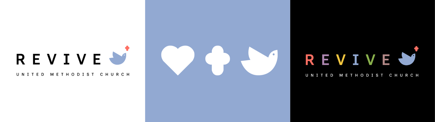

I am so excited to announce that the Leadership Board has approved the rollout of a new Revive UMC logo! This has been a long-term effort by so many people to update our look and help us communicate well who we are to newcomers and community members outside our church. The process included finding a graphic designer, filling out a questionnaire to help our designer know who we are, coming up with language for how we want to communicate ourselves to the world, considering early options, and deciding on colors. The word that stood out to us in that process was “open-hearted”. We want the world to know that we are an open-hearted people. Here’s some things to know:
What’s Staying the Same
We are Still Overtly Christian
It was really important to the Leadership Board that we have a cross in our logo so that everybody knows that we are followers of Jesus. We are a people of the Bible who strive every day to walk the way of the cross. The cross is proudly displayed.
We are Still Proudly United Methodist
We are Revive United Methodist Church! We love the UMC and will continue to communicate clearly and boldly that’s who we are.
We are Still Represented by a Dove
I’ve said many times that Revive UMC was breathed into existence by the Holy Spirit. The dove was the physical manifestation of the Spirit of God at Jesus’ baptism. We are a people guided by the Holy Spirit in all that we do. It is fitting that a dove is our primary image, both in our first logo and in this new one.
We are Still Inclusive
Everything about this design is purposeful. Our designer was very inspired by our inclusive stance. So much so that the font that she chose for us is called inclusive sans. It’s a font designed to be easily read by all people, including and especially those with older eyes or a visual handicap of some kind. Even down to our font, Revive is an inclusive church!
What’s Different
We have New Colors
We asked the designer to give us color options that not only represent Revive today but also feel current to 2026. We think that the coral is a nice nod to the Holy Spirit fire from our first logo. And the blue feels inviting and calming.
We have a Design that Reflects Who We Are Today
We have grown and changed since our beginning. This design is a chance for us to reflect that growth when we invite new people to church.
We have Options
Our primary logo has the blue and coral design. However, the designer originally gave us three different color combinations to choose from with six different colors. Then she realized that actually, all six of those colors go really well together. So the Leadership Board decided to keep those six colors for special occasions, future designs, and possibly a future Early Learning Center for preschool children. This gives us a lively bunch of colors and a lot to play with, which also represents our identity well.
I am really thrilled with how this process turned out and I’m excited to start seeing the new look take shape. Pretty soon, you’ll see new signs and designs on our familiar landscape. The Marketing Team, under the guidance of the Foundations Team, is in the process of getting a “Future Home of Revive United Methodist Church” sign up on the new property. You will also have the opportunity to order a new t-shirt and nametag. So be on the lookout for all the fun things!!
Love and peace,
Katie